Nastee-designs

Nastee-designs is a blog where a solid design get's supported.

My Photo
Name:
Location: Aalst, Belgium

I have been busy, on and off, with designing from my 15th. I have been improved and learned a lot during the last 4 year. I'm not having a specific style. Because I like to try a lot of styles out. My most used programs are photoshop and illustrator. (firefox) see ya

Saturday, June 13, 2009

11 June 09

Smoky Heaven


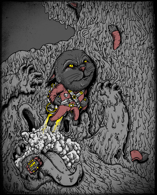
Smoky Heaven is a design made by svenh.
It's a one color design, all over and illustrates a nice looking scene.
What I like about it is the sketchy feeling and the use of weight.
With the weight I mean the contrast between the bottom (the reaper) and the angel on the top. In the bottom are the shadows dominant, while the opposite happens by the angel. It hink this contrast is what helping to look good on the mock-up.
So together with the fact that the theme/concept/scene is something anybody can wear it on a tee make me wanna give this a vote.
Check it out and give it some support.


VOTE HERE


10 June 09

HERE'S,
Another amazing threadless-submission, from an amazing artist.
I give you "Mission Accomplished" from alexmdc.


In my head I was trying to order the good and bad points, but it seems I can't find any bad point. So I will just be pointing out what I find so good about this design.
First of all I love the placement. In my opinion this is one of the best placements I have seen in a while. The neg. space on the left shoulder, keeps the design from being to much.
The linework, the composition and that cool expression on that cat's face finishes it for me. Personal I like the 1-color version the most.
Anyway voted for sure, hope you give it some vote-love too.

ps. Make sure to check his other submission and wins out, they are all amazing.


VOTE HERE
Mission Accomplished - Threadless T-shirts, Nude No More


09 June 09

HI
After a couple of days without any design been posted I have to make it up to you guys.
So I will start of with a submission called paint the world from 110specialblack.


The first thing I notice that it isn't the anything like the avarage submission you find back on DBH. But the techniques used here together with the use of color makes this stand out.
The shades let me think on some techniques that tattoodesigners uses. Because of the use to outline almost everything on the inside with white, and just than start with the shadows. (Hope you understand my rattle here.)
The colours does remind probably everyone to cmyk-designs. But it obviously is not, it is even not RGB (the red looks to be a darker shade). But the colors just work on a tee and that's what's important.

So for this work get's my vote because of the shadows, the colors and his "differnet than others-factor".
Check it out and give it some support if you like it too.


Vote here


Monday, June 8, 2009

08 June 09

Evasion
e-va-sion
Origin late Middle English (in the sense (prevaricating excuse)): via Old French from Latin evasio(n-), from evadere.


click on the pic to get the fullview


This design from Oiseau is a design that I liked from the moment I saw it.
The use of black and white is perfect. The style that does remind me at old drawings when they started to learn about the human anatomy was always near my heart.
But the face isn't anatomy based (organic it is) yet it looks that way. *IMPRESSED*
Anyway This shirt I would love to wear.
So it got my vote.
Hope it get's your vote as well.
Let this be printed!!!


VOTE HERE


07 June 09

String Figures,


click on the pic to get the fullview


This design is from Leftist Jesuit and currently running in the threadless-competition.
This design popped out to me with the fine details that you can find back in the design.
For instance the light on the hands are so present without being to obvious. They are not fighting for attention. But they work well together with the hand and the shadows.
I think this shows proffesionalism.
Those hands aren't represent realistic wich helps the design alot, also the colors help to give this design it's own personality. Maybe because I'm in love with that bleu, maybe not.
The only thing I don't like that much is the mock up, because of the right hand going under the arm. A bit smaller it would look a 10/10.
Anyway It got my vote
now it's up to you guys to support it if you like it too.
peace.


String Figures - Threadless T-shirts, Nude No More