06 June 09 (2)
Hi,
This my second submission on this new blog to support and promote some great designs. I will be updating this blog daily, so keep an eye out.
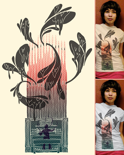
My Music,

This design from againstbound can use some support.
I first intended to review his "Out of Luck"-design (the one with the ace) But when I saw trough his other submissions, I noticed this one.
The biggest strenght of this design is that it works on a tee.
The placement, the gradient and the overall volume of the design works together so well, that I was surprised.
If the gradient was upside down it would be crap, if the dripping doodles wouldn't be there it would be not as good. etc..
And the bonus is the texture wich finishes the design off.
So A nice balanced and simple design that got my vote.
How about yours?
VOTE HERE,
This my second submission on this new blog to support and promote some great designs. I will be updating this blog daily, so keep an eye out.
My Music,

This design from againstbound can use some support.
I first intended to review his "Out of Luck"-design (the one with the ace) But when I saw trough his other submissions, I noticed this one.
The biggest strenght of this design is that it works on a tee.
The placement, the gradient and the overall volume of the design works together so well, that I was surprised.
If the gradient was upside down it would be crap, if the dripping doodles wouldn't be there it would be not as good. etc..
And the bonus is the texture wich finishes the design off.
So A nice balanced and simple design that got my vote.
How about yours?
VOTE HERE,

0 Comments:
Post a Comment
Subscribe to Post Comments [Atom]
<< Home